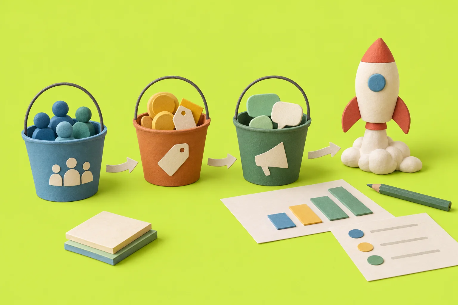
Design pricing like a sommelier: order, pairings, palate cleansers
Use a sommelier’s tasting sequence to order tiers, add strategic pairings and timed offers so the target tier becomes the obvious choice.
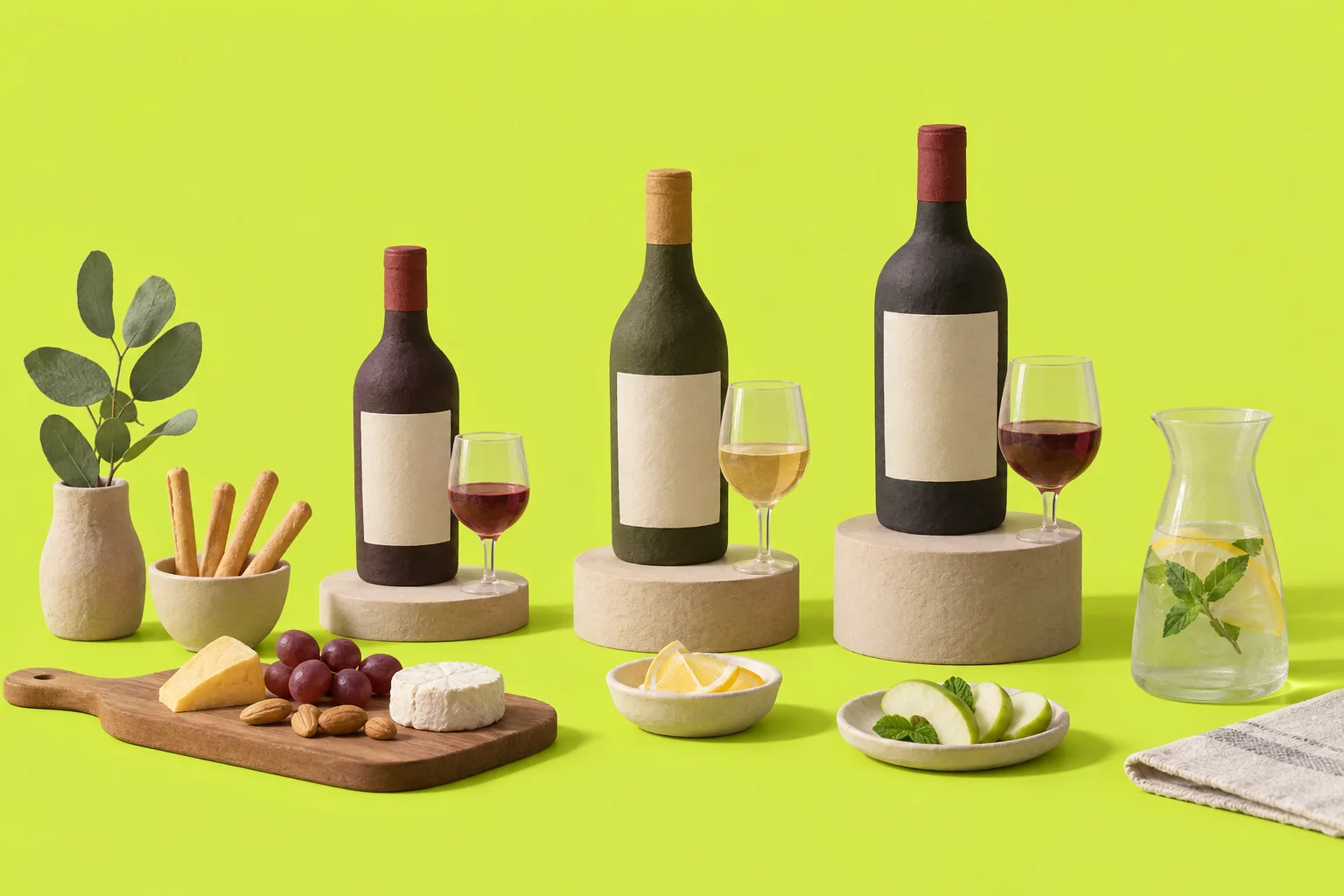
Who this is for: product managers who own B2B or B2C pricing and packaging and feel stuck on adding tiers or discounting. What you'll have: a repeatable sequence to order your offers, a set of pairings, and a sprint plan to test the changes.
Treat your pricing page like a tasting menu. Serve a small free taste, guide buyers through a clear progression, add short-term offers to reset value perception, and use believable decoys and compact add-ons to raise willingness-to-pay.
Why common pricing menus fail
Buyers often see price as a single point. When tiers are listed alphabetically or by feature names, the middle option vanishes. That pushes teams to discount or to add confusing add-ons. The result: lower revenue and more support questions.
How a sommelier's tasting sequence maps to offers
A sommelier designs flow and contrast. Apply that to pricing.
- Amuse-bouche — a small, free taste: short free trial or demo that proves the core value.
- Light — entry tier: low price, clear outcomes, gets users started.
- Crescendo — growth tier: the intended revenue target. Feature progression and performance increase here.
- Palate cleanser — timed free value: temporary credits, usage bursts or discounted first-year to reset perception.
- Finale — premium bundle: a high-ticket option that reads as a considered finish, sometimes used as an anchor or decoy.
Step-by-step: design the sommelier-priced menu
1. Put the amuse-bouche first
Offer a short, focused trial that proves one core outcome. Make it friction-light. Track which users reach the outcome.
2. Define the entry tier
Keep the entry tier honest and compact. It should feel complete for small teams or single users. Avoid hiding must-have capabilities behind paywalls.
3. Build the crescendo
Design the growth tier to deliver a clear step up: measurable speed, capacity or outcomes. This is the tier you want most buyers to choose.
4. Add pairings
Offer small, high-margin attach items that amplify the growth tier: integrations, onboarding hours, templates. Price them so they look like an easy upgrade.
5. Add palate cleansers
Use limited, meaningful offers: temporary credits, a first-year discount, or a short feature unlock. These re-anchor expectations without permanent discounting.
6. Craft a believable decoy
Create a premium option that is clearly expensive and ill-fitting for most buyers. It should be real and defensible. The goal is contrast, not deception.
Present the menu with contrast and pace
Order matters. Show the trial, then entry, then growth. Use copy to explain the progression in plain steps. Highlight one recommended tier with a badge. Place pairings next to the growth tier and show the palate cleanser as a time-limited callout.
| Element | Alphabetical listing | Sommelier sequence |
|---|---|---|
| Order | Flat, equal weight | Trial → Starter → Growth → Palate cleanser → Finale |
| Visibility of mid tier | Often hidden | Highlighted as progression with badge |
| Upgrade friction | High, unclear steps | Lower—pairings and clear outcomes |
| Discount pressure | Frequent | Reduced—short, purposeful offers |
Design the menu so each step answers two buyer questions: "What do I get?" and "Why next?".
Checklist: mistakes to avoid
- Don’t hide core capabilities in add-ons so tiers lose coherence.
- Decoy must be believable. Fake or useless features erode trust.
- Don’t overload pairings. Too many choices confuse buyers.
- Don’t run palate cleansers constantly. Buyers will wait for them.
Worked example: a workflow SaaS
Presentation, following the tasting order:
- Amuse-bouche: A 14-day trial that demonstrates the primary workflow automation in a few clicks.
- Entry tier: Starter at $15 per user per month. Clear limits and useful templates so small teams can operate without add-ons.
- Crescendo (target): Growth at $45 per user per month. Highlighted with a RECOMMENDED badge. Shows measurable improvements: faster approvals, more automations.
- Pairing: Team Onboarding — a one-time $300 add-on that sets up templates and runs a kickoff. Sold alongside Growth on the pricing card.
- Palate cleanser: 30% off the first year of Growth for customers who commit annually during the trial period. Time-limited, shown as a streaked callout.
- Finale / Decoy: An expensive Enterprise plan with extra consulting hours and confusing bespoke services. It exists to make Growth look like the sensible, well-scoped choice.
Why this works: the trial proves value, Starter gets users in, Growth is presented as the clear next step, the onboarding pairing reduces upgrade friction, the 30% first-year offer resets price perception, and the decoy increases contrast.
How to test it in one sprint
Run an A/B test on the pricing page for one sprint (1–2 weeks):
- Variant A: current alphabetical or feature-list presentation.
- Variant B: sommelier sequence—trial first, Starter, Growth with recommended badge, pairing add-on near Growth, palate cleanser callout, and decoy Enterprise.
Primary metrics: add-to-quote (or add-to-cart for self-serve) for Growth and conversion from trial to Growth. Secondary: attach-rate for the Team Onboarding add-on and average revenue per customer.
Micro-experiments: test two price points for the onboarding pairing (for example $200 vs $300) to find the sweet spot. Track attach-rate and net revenue impact.



If you test and iterate, you will learn which pairings sell, which temporary offers re-anchor value, and how much contrast your decoy needs. The sommelier approach is a framework. It forces you to choose order, pacing and small high-value attachments instead of defaulting to endless lists or discounts.